How to Create Dynamic Social Media Icons Using CSS3
 Social media is a viral means of marketing as well as communicating with your customers. Social medial icons are largely used in websites as they can help your visitors share your content with ease and promote your blog or website in hence.
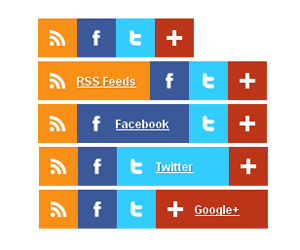
How about leaving behind your usual social media icons and choose something more special? In this article I will teach you how to create cool dynamic social media icons using CSS3. CSS3 transition was used to implement the dynamic effect, so there is no JavaScript or jQuery required. Enjoy and share your thoughts in a comment.
Copy and paste the HTML and CSS codes in your page. Make your own social media icons special too.
.exicons {
position: relative;
height: 40px;
}
.exicons a{
font-family: 'Open Sans', Helvetica, Arial, sans-serif;
width: 40px;
-webkit-transition:width 0.4s;
-moz-transition:width 0.4s;
transition:width 0.4s;
text-decoration: none;
}
.exicons a:hover{
width: 120px;
}
.exicons ul { margin: 0; padding: 0;}
.exicons li,.exicons li a {
display: block;
position: relative;
width: 40px;
height: 40px;
float: left;
width: auto;
overflow: hidden;
}
.exicons li a {
width: 40px;
line-height: 40px;
color: #FFF;
font-size: 12px;
font-weight: bold;
text-shadow: 1px 1px 1px rgba(0,0,0,0.3);
}
.exicons li.rss a { background-color: #F88F16; }
.exicons li.facebook a { background-color: #3B5998; }
.exicons li.twitter a { background-color: #3CF; }
.exicons li.googleplus a { background-color: #BD3518; }
.exicons img { float: left; text-align:right; margin-left:12;margin-top:12;margin-right:12}

 RSS Feeds
 Facebook
 Twitter
 Google+