10+ Red and Green Combinations
Red and green are two colors that are strongly associated with Christmas, but they can also be used in home decor all year round. Red is a bold and passionate color, while green represents growth, renewal, and nature. Together, they create a harmonious and balanced color combination that can add energy and vitality to any room. But what colors go well with red and green? Here are 10+ red and green combinations to inspire your home decor.
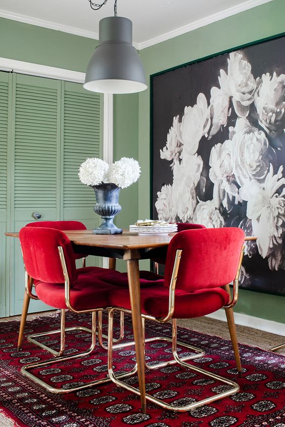
Valentine Red, Army Green and Dark Beige

This is a striking color combinations that brings together passion, nature, and warmth. It holds a unique charm, blending the boldness of red, the earthiness of green, and the subtlety of beige. This color palette can surely add depth and character to your home decor.
Valentine Red, with its vibrant and romantic appeal, injects energy and excitement into any space. When paired with the natural and soothing tones of Army Green, a connection to the outdoors is established, evoking a sense of tranquility and harmony. The addition of Dark Beige brings balance and grounding to the mix, providing a neutral backdrop that allows the other colors to shine.
When used together, these colors can create a variety of effects in your home decor. For instance, you could paint the walls in Dark Beige, add Valentine Red accents through decorative pillows or artwork, and incorporate Army Green in furniture or drapery.
Red, Green, and Natural Wood
If you’re looking for a touch of nature-inspired charm, consider incorporating a color combination of Red, Green, and Natural Wood. This palette combines the fiery energy of red, the refreshing vibe of green, and the warm allure of natural wood tones. It’s a perfect choice for adding a sense of vitality and timeless beauty to your space.
Red, Green, and Blue
If you love classic color combinations, you can’t go wrong with Red, Green, and Blue. This color combinations brings together the primary colors, resulting in a visually striking and dynamic palette. Red adds passion and excitement, green brings freshness and harmony, while blue offers a serene and calming presence. Embrace this combination to create a balanced and versatile look that stands the test of time.
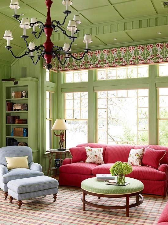
Dusty Red, Greyish Green and Link Water

This color combination brings together warmth, tranquility, and a touch of softness. Each color carries its own unique meaning and symbolism, creating a harmonious blend that can enhance the ambiance of any space.
Dusty Red, with its muted and earthy undertones, exudes a sense of warmth, passion, and intimacy. It adds depth and richness to a room, creating a cozy and inviting atmosphere. Greyish Green, on the other hand, represents a connection to nature, balance, and renewal. It brings a calming and refreshing feel, reminiscent of lush greenery. Lastly, Link Water, a soft and subtle hue, adds a touch of tranquility and serenity to the combination, creating a soothing and relaxing environment.
When incorporating these colors into your home decor, you have various options. You could paint the walls in Greyish Green or Link Water for a serene backdrop and use Dusty Red as accents through upholstery, throw pillows, or artwork. Alternatively, you can opt for Dusty Red walls with furniture and decor in Greyish Green and Link Water to create a soothing and harmonious space.
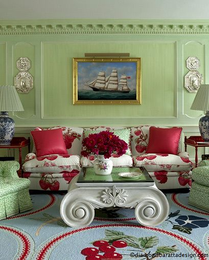
Persian Red, Mineral Green and White

Persian Red, with its deep and rich tones, conveys passion, power, and warmth. It adds a touch of drama and sophistication to any setting, making it an excellent choice for accent pieces or focal points. Mineral Green, on the other hand, represents growth, harmony, and the beauty of nature. Its calming and refreshing qualities bring a sense of tranquility and balance to the color palette. White, a symbol of purity and simplicity, enhances the overall aesthetic, creating a clean and timeless look.
When incorporating these colors into your home decor, you could use Persian Red and Mineral Green as accent colors through accessories, such as throw pillows, curtains, or artwork, against a backdrop of white walls for a crisp and sophisticated look. Another option is to use Persian Red as a dominant color, Mineral Green as a secondary hue, and white as a neutral base, creating a balanced and visually striking color scheme.
Red, Forest Green, and Terra Cotta
For an earthy and rustic look, consider combining Red, Forest Green, and Terra Cotta. This color palette brings together the intensity of red, the freshness of forest green, and the warmth of terra cotta. The result is a natural and organic vibe that’s reminiscent of the outdoors. Use this combination to infuse your space with a cozy and inviting atmosphere, perfect for rustic or Mediterranean-inspired designs.
Red, Teal, and Mustard Yellow
If you’re seeking a bold and eclectic style, embrace the combination of Red, Teal, and Mustard Yellow. This vibrant palette brings together the intensity of red, the richness of teal, and the warmth of mustard yellow. It’s a playful and energetic choice that adds personality and flair to any space. Ideal for modern or bohemian interiors, this combination allows you to unleash your creativity and make a bold statement.
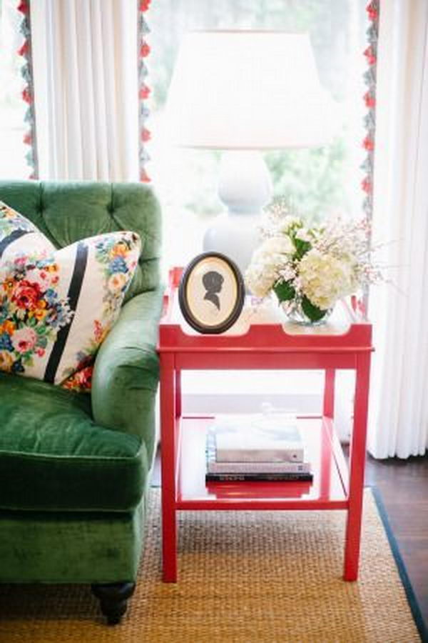
Pinkish Red, Spanish Green and Black White

Pinkish Red, with its delicate and romantic undertones, represents love, passion, and energy. It adds a touch of warmth and excitement to the color palette, making it a bold choice for statement pieces or accent details. Spanish Green, inspired by the lush greenery of nature, symbolizes growth, freshness, and harmony. Its soothing and calming qualities bring a sense of tranquility and balance to the overall composition. Black White, a classic and timeless combination, offers a modern twist to the color scheme. It represents elegance, sophistication, and simplicity, providing a striking contrast to the vibrant hues of Pinkish Red and Spanish Green.
When incorporating these colors into your home decor, you can use Pinkish Red and Spanish Green as accent colors through upholstery, decorative accessories, or wall art, against a backdrop of Black White for a contemporary and chic look. Alternatively, you can use Pinkish Red as the dominant color, Spanish Green as a complementary hue, and Black White as a grounding element to create a harmonious and visually striking color scheme.
Iguana Green, Dull Red and Cadet Grey

Iguana Green, reminiscent of lush foliage, represents growth, harmony, and balance. Its natural and calming qualities bring a sense of tranquility to the color palette. Dull Red, with its muted and subdued appearance, evokes warmth, passion, and a touch of nostalgia. It adds a subtle pop of color and visual interest to the overall composition. Cadet Grey, a cool and neutral shade, symbolizes stability, elegance, and sophistication. Its understated presence provides a grounding element to the color scheme.
When using these colors into your home decor, you can use Iguana Green as the dominant color for walls or large furniture pieces, complemented by accents of Dull Red through textiles or decorative accessories. Cadet Grey can be used as a neutral backdrop or as a contrasting element to enhance the richness of the other colors. Alternatively, you can opt for a more balanced approach by incorporating equal amounts of all three colors throughout the space, creating a cohesive and sophisticated atmosphere.
Red, Green, and Greige
For those seeking a sophisticated and modern ambiance, consider the combination of Red, Green, and Greige. The intensity of red, the freshness of green, and the neutrality of greige harmonize beautifully to create a stylish and contemporary feel. With greige acting as a grounding element, this palette allows the red and green to shine while maintaining a sleek and balanced aesthetic.
Red, Green, and Tan
If you’re aiming for a warm and inviting atmosphere, explore the color combination of Red, Green, and Tan. The vibrancy of red and green is complemented by the natural elegance of tan, resulting in a cozy and welcoming ambiance. This combination is perfect for creating a comforting and inviting space that exudes warmth and hospitality.
