CSS3 Flip Animation Tutorial with Demos
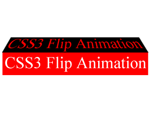 CSS3 animation is always a fun topic to explore and it will of course attract your readers’ eyes. These visitors will probably share your content with some others and promote your blog or website in hence. Today we are going to show you how to create a CSS3 flip animation as soon as possible.
The implementation of CSS3 flip animation involves setting up a transformation to take place in response to a mouse over or other event. Using a transition timing function which applies the transformation/s over a set time period, the CSS3 animation will go smoothly.
The HTML and CSS code is self explanatory with key codes highlighted. Replace the links with your own and make your website more attractive.
3d Horizontal CSS3 Flip
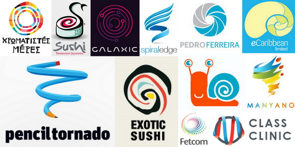
Spiral symbol is always associated with snail, whirlwind, conch, sushi, etc. Spiral logos are always impressive and visually dynamic. As the thickness, diameter, material, color, width and dimensions changes, the image of spiral is very different. Logos inspired by spiral symbol are powerful and beautiful at the same time and they can catch people’s eyes at the first time.
Below are 40 spiral logo designs inspired by the spiral symbol. These cool spiral shape logos are suitable for company or website in the fields of sports, food, travel and other creative industries. Take time to browse through this amazing collection on how designers turned a spiral into a remarkable logo. They will surely freshen your creative juices.
Content on the front coverContent on the back cover
#horizontal-3d {
	position: relative;
	width: 600px;
	height: 300px;
}
#horizontal-3d {
  -webkit-perspective: 1000px;
  -moz-perspective: 1000px;
  -o-perspective: 1000px;
  perspective: 1000px;
}
#horizontal-3d:hover #flipcard {
	-webkit-transform: rotateY(180deg);
	-moz-transform: rotateY(180deg);
	-o-transform: rotateY(180deg);
	-ms-transform: rotateY(180deg);
	transform: rotateY(180deg);
}
#horizontal-3d .face.back {
	-webkit-transform: rotateY(180deg);
	-moz-transform: rotateY(180deg);
	-o-transform: rotateY(180deg);
	-ms-transform: rotateY(180deg);
	transform: rotateY(180deg);
}
#flipcard {
	width: 100%;
	height: 100%;
	-webkit-transform-style: preserve-3d;
	-moz-transform-style: preserve-3d;
	-ms-transform-style: preserve-3d;
	transform-style: preserve-3d;
	-webkit-transition: all 1s linear;
	-moz-transition: all 1s linear;
	-o-transition: all 1s linear;
	-ms-transition: all 1s linear;
	transition: all 1s linear;
}
.face {
	position: absolute;
	width: 100%;
	height: 100%;

  	-webkit-backface-visibility: hidden;
  	-moz-backface-visibility: hidden;
  	-o-backface-visibility: hidden;
  	backface-visibility: hidden;
}
.face.back {
	display: block;
	background-color: lightblue;
}
.front img {
	width: 100%;
	display: block;
}
3d Vertical CSS3 Flip

Spiral symbol is always associated with snail, whirlwind, conch, sushi, etc. Spiral logos are always impressive and visually dynamic. As the thickness, diameter, material, color, width and dimensions changes, the image of spiral is very different. Logos inspired by spiral symbol are powerful and beautiful at the same time and they can catch people’s eyes at the first time.
Below are 40 spiral logo designs inspired by the spiral symbol. These cool spiral shape logos are suitable for company or website in the fields of sports, food, travel and other creative industries. Take time to browse through this amazing collection on how designers turned a spiral into a remarkable logo. They will surely freshen your creative juices.
There is no change in HTML code. Based on the CSS code on the above,replace all rotateY to rotateX
#vertical-3d {
	position: relative;
	width: 600px;
	height: 300px;
}
#vertical-3d {
  -webkit-perspective: 1000px;
  -moz-perspective: 1000px;
  -o-perspective: 1000px;
  perspective: 1000px;
}
#vertical-3d:hover #flipcard {
	-webkit-transform: rotateX(180deg);
	-moz-transform: rotateX(180deg);
	-o-transform: rotateX(180deg);
	-ms-transform: rotateX(180deg);
	transform: rotateX(180deg);
}
#vertical-3d .face.back {
	-webkit-transform: rotateX(180deg);
	-moz-transform: rotateX(180deg);
	-o-transform: rotateX(180deg);
	-ms-transform: rotateX(180deg);
	transform: rotateX(180deg);
}
2d Horizontal CSS3 Flip

Spiral symbol is always associated with snail, whirlwind, conch, sushi, etc. Spiral logos are always impressive and visually dynamic. As the thickness, diameter, material, color, width and dimensions changes, the image of spiral is very different. Logos inspired by spiral symbol are powerful and beautiful at the same time and they can catch people’s eyes at the first time.
Below are 40 spiral logo designs inspired by the spiral symbol. These cool spiral shape logos are suitable for company or website in the fields of sports, food, travel and other creative industries. Take time to browse through this amazing collection on how designers turned a spiral into a remarkable logo. They will surely freshen your creative juices.
There is no change in HTML code. Based on the CSS code for 3d horizontal CSS3 flip, delete the following codes
#horizontal-3d {
  -webkit-perspective: 1000px;
  -moz-perspective: 1000px;
  -o-perspective: 1000px;
  perspective: 1000px;
}
Result:
#horizontal-2d {
	position: relative;
	width: 600px;
	height: 300px;
}
#horizontal-2d:hover #flipcard {
	-webkit-transform: rotateY(180deg);
	-moz-transform: rotateY(180deg);
	-o-transform: rotateY(180deg);
	-ms-transform: rotateY(180deg);
	transform: rotateY(180deg);
}
#horizontal-2d .face.back {
	-webkit-transform: rotateY(180deg);
	-moz-transform: rotateY(180deg);
	-o-transform: rotateY(180deg);
	-ms-transform: rotateY(180deg);
	transform: rotateY(180deg);
}
2d Vertical CSS3 Flip

Spiral symbol is always associated with snail, whirlwind, conch, sushi, etc. Spiral logos are always impressive and visually dynamic. As the thickness, diameter, material, color, width and dimensions changes, the image of spiral is very different. Logos inspired by spiral symbol are powerful and beautiful at the same time and they can catch people’s eyes at the first time.
Below are 40 spiral logo designs inspired by the spiral symbol. These cool spiral shape logos are suitable for company or website in the fields of sports, food, travel and other creative industries. Take time to browse through this amazing collection on how designers turned a spiral into a remarkable logo. They will surely freshen your creative juices.
Based upon the CSS code for 3d horizontal CSS3 flip, delete the following codes
#horizontal-3d {
  -webkit-perspective: 1000px;
  -moz-perspective: 1000px;
  -o-perspective: 1000px;
  perspective: 1000px;
}
And replace all rotateY to rotateX
#vertical-2d {
	position: relative;
	width: 600px;
	height: 300px;
}
#vertical-2d:hover #flipcard {
	-webkit-transform: rotateX(180deg);
	-moz-transform: rotateX(180deg);
	-o-transform: rotateX(180deg);
	-ms-transform: rotateX(180deg);
	transform: rotateX(180deg);
}
#vertical-2d .face.back {
	-webkit-transform: rotateX(180deg);
	-moz-transform: rotateX(180deg);
	-o-transform: rotateX(180deg);
	-ms-transform: rotateX(180deg);
	transform: rotateX(180deg);
}

great